Standing in my local Game shop circa 1996, staring at the N64 display unit, I remember thinking the console looked like it belonged on the bridge of the Enterprise. But it wasn't just the mushroom-gray plastic or those bizarre three-pronged controllers—it was that logo. That pristine, geometric "64" floating inside what looked like a chrome-plated Rubik's cube. Even then, aged fifteen and mostly concerned with whether I had enough saved to buy one, something about that design felt…different.
Fast-forward nearly thirty years, and I'm scrolling through modern tech companies desperately trying to look cutting-edge with their flat, minimalist logos. You know the type—sans-serif fonts so clean they could perform surgery, gradients that cost more than my first car, symbols that look like they were designed by a committee of Scandinavian architects. And yet none of them have the visual punch of Nintendo's N64 logo. Not one.
That cube still looks like the future, which is frankly ridiculous when you consider it was designed to sell a console that struggled with anti-aliasing and had texture pop-in you could time with a stopwatch.
I've been tinkering with design work for years now—nothing fancy, just the usual suspects: Photoshop battles with RetroTINK scanline settings, mockups for homebrew game labels, the occasional website header that doesn't make people's eyes bleed. And every time I stare at a blank canvas wondering how to make something look "futuristic," that N64 cube pops into my head like a design lesson I never formally took.
The genius isn't in the complexity—it's actually dead simple when you break it down. Take a cube, make it isometric, polish it until it looks like liquid mercury, then slam some chunky numerals inside it. Job done. Except it's not done, is it? Because somehow those few elements create this perfect storm of visual appeal that still works today.

I remember getting my hands on the actual console manual (you know, back when manuals were thick enough to use as weapons), and that logo was everywhere. Embossed on the cover, printed on the warranty card, stamped into the plastic of the cartridges themselves. Nintendo wasn't being subtle about it—they knew they had something special. The whole visual identity screamed "this machine is from the future," even though under the hood it was already showing its age compared to what PCs could do.
The logo worked because it didn't try to explain what the console did. It didn't have little cartoon characters pointing at features, didn't spell out "SIXTY-FOUR BIT GAMING SYSTEM" in twelve different fonts. It just sat there, confident and chrome, like a piece of technology that had fallen through a wormhole from 2020. Which, honestly, is probably what good logo design should do—suggest possibilities rather than catalogue specifications.
What really gets me is how that cube became shorthand for "serious gaming" in a way that Nintendo's previous logos never managed. The NES had that chunky brick logo that looked like it was carved from LEGO blocks. The SNES went for that purple and gray thing that always reminded me of a corporate PowerPoint presentation. But the N64 cube? That thing had gravitas. You could stick it on a racing car or a space helmet and it wouldn't look out of place.
I've got an original N64 sitting under my telly right now (don't judge—it's next to the RetroTINK and everything's properly RGB'd), and sometimes I catch myself just staring at that molded logo on the front of the machine. There's something almost hypnotic about it, the way the light hits those beveled edges differently depending on the angle. It's like Nintendo accidentally created a piece of minimalist sculpture and then decided to shove a graphics chip inside it.
The typography inside the cube is perfect too—those chunky, slightly rounded numerals that look carved from solid metal. They could've gone with thin, sci-fi lettering like everyone else was doing in the '90s, all laser-cut angles and unnecessary serifs. Instead, they chose something that felt substantial, permanent. Like those numbers were going to outlast the heat death of the universe.
And they might, actually. Because unlike most '90s design, which aged about as well as my old frosted tips, that N64 logo still pops up everywhere. Retro gaming channels use it as shorthand for "the good stuff." Indie developers slap cube-based logos on their games hoping to capture some of that visual DNA. Hell, I've seen it tattooed on people who probably weren't even born when Ocarina of Time launched.
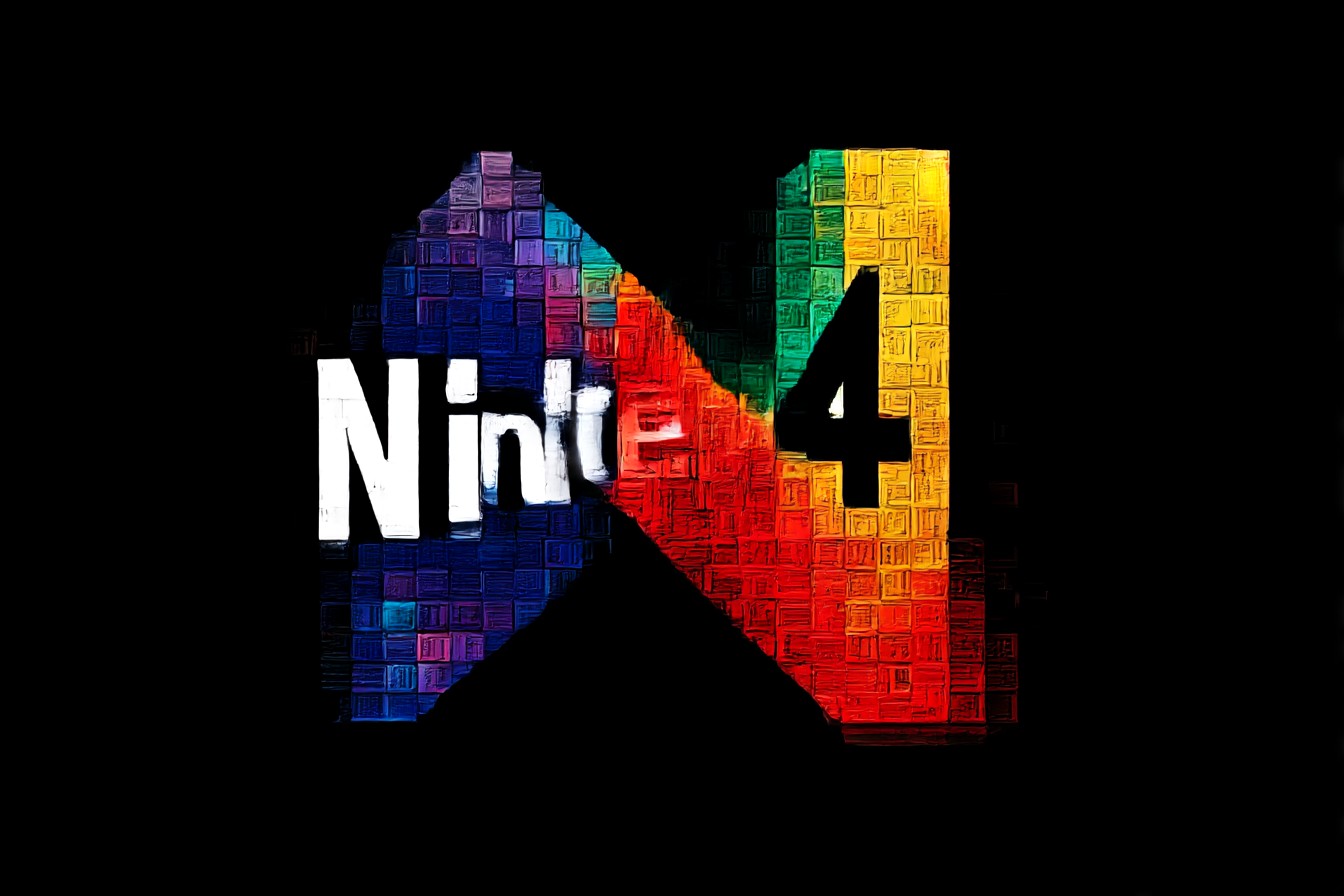
The cube also worked perfectly with Nintendo's whole identity at the time. This was peak Nintendo confidence—they'd just spent the 16-bit era getting absolutely battered by Sega's attitude and Sony's CD-ROM future-tech, and here they were bouncing back with analog sticks and proper 3D graphics. The logo needed to say "we're not just back, we're ahead of everyone else again," and somehow that simple geometric shape managed to do exactly that.
I think about this stuff way too much, probably. But when you've spent decades watching companies spend millions on rebrands that make them look more generic than before, you start to appreciate the ones that just… work. The N64 logo works because it doesn't try to be everything to everyone. It's not friendly or approachable or accessible. It's not trying to appeal to families or hardcore gamers or casual players. It's just cool, in that effortless way that can't be manufactured or focus-grouped into existence.
Even now, when I fire up an N64 emulator or dust off Project64 for a quick Mario Kart session, that logo loading screen still gives me a little thrill. Not just because of the games that are about to follow, but because of what that cube represents—a moment when a company looked at the future and designed something that belonged there.
And honestly? In a world where everything's getting flatter and more minimal by the day, that chrome cube looks more futuristic than ever. Sometimes the best way to predict the future is to design something timeless enough to outlast it.